MacWrench 1.3.0 — Redesigned Homebrew with App Store-style discovery
The Homebrew tab gets the largest design pass since launch — flat segmented navigation, an App Store-style Discover feed, and real cask icons for the apps you actually install.
The Homebrew tab finally feels like a proper tab
The 1.2 Homebrew tab worked, but it always felt a step removed from the rest of MacWrench. A nested split view with its own middle column. A toolbar that visually broke into chunks on narrow windows. Empty bands of chrome you couldn't get rid of. It was functional, but it didn't match the calm of the Apps and Cleaner tabs.
1.3.0 throws all of that out. The new Homebrew tab uses a flat segmented-picker pager — Browse / Packages / Services — that mirrors the Cleaner pattern. No middle column. No chunked toolbar. The window is wide enough now to do real work even on a 13" display.
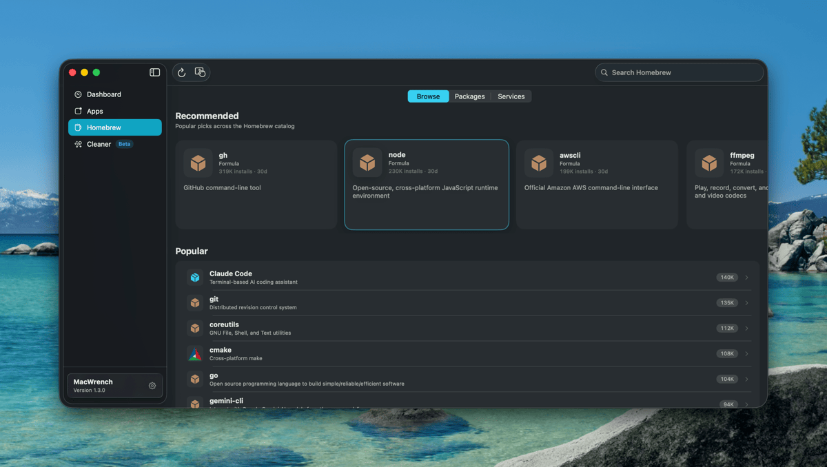
Discover, like an App Store
The biggest change is what Browse does now. Instead of a generic catalog list, you land on a single composite scroll that mirrors the App Store's discovery pattern:
- A Recommended carousel at the top — the week's most-installed casks across the Homebrew catalog, refreshed every time you reload
- A Popular vertical list with 30-day install counts inline — the staples like
git,node,ffmpeg, and nowclaude-code,gemini-cli - A Categories grid for browsing by intent — Productivity, Developer Tools, Media, etc.
The search bar at the top filters all three sections at once. Type "rectangle" and the entire Browse surface narrows to matching results — Recommended, Popular, and Categories collapse around the query. There's no separate search screen to navigate into and back out of.
Hover anywhere and the affordances tell you what's tappable: Recommended cards lift slightly with an accent border, rows highlight, Categories cards lift gently. Tap any of them and you push into a single navigation stack — no more dropped taps when you cross between Browse subsections.
Real cask icons
For the longest time, every cask in MacWrench showed the same generic box icon. That's because Homebrew itself doesn't ship icons — casks are install scripts, not apps. So when you scrolled through Browse, Notion, Slack, Obsidian, Rectangle, 1Password, Discord, VS Code all looked identical. You read by name, not by glance.
1.3.0 fixes that by chaining three resolvers behind every cask icon. First it checks App-Fair's appcasks — the same icon source that Applite and App Fair.app use, hosted as GitHub Releases and built specifically for the Homebrew ecosystem. If that misses, it falls back to Apple's iTunes Search API with a strict trackName match — strict enough that you never see "Magnet" come back for a "Rectangle" search, or "Notion Web Clipper" come back for "Notion". If both miss, you get an SF Symbol that visually fits the category. The result is roughly 80%+ icon coverage for the casks people actually install.
Under the hood, every icon lookup goes through a process-wide cache that coalesces concurrent requests, remembers misses so we don't keep retrying, and HEAD-probes URLs before handing them to the image view — so you never see a broken-image placeholder while the network spins up.
Filter chips on Packages
The old Packages tab had a sub-sidebar with four sections: Updates, Up to Date, Ignored, Unknown. It was the second navigation level inside an already-nested split view, and it was the main reason the Homebrew tab felt cramped on narrow windows.
The sub-sidebar is gone. In its place: a chip row at the top of the package list. Tap Updates to see what's outdated. Tap Ignored to review what you've snoozed. Tap Up to Date when you want to confirm a clean state. Single source of truth, single tap to switch, and the package list breathes properly underneath.
A smarter root toolbar
"Upgrade All Packages" used to live in the toolbar at all times — even when you were browsing the catalog and there was nothing to upgrade. Now it only appears when you're actually on Packages → Updates, where the action makes sense. The refresh button got similar treatment: on Browse it refreshes the catalog, on Packages it refreshes the installed list, on Services it reloads service state. Same button, contextual behavior.
The package detail screen, polished
Tapping into a package now feels closer to opening an App Store listing. The icon is bigger (88×88 instead of the old 48×48). The title is large and bold instead of body text. Cask vs. Formula is rendered as a tinted badge instead of a label. And the 30-day install count sits inline with the metadata so you can immediately gauge how popular and active a package is before installing it.
Three real fixes
Dashboard crash on launch. A small fraction of users were hitting a SIGTRAP on launch when the Dashboard donut chart raced with SwiftUI's layout pass during the initial disk scan. 1.3.0 defers the chart mount by one runloop tick — small, surgical, idempotent across re-renders — which fully closes the race.
"Couldn't load catalog" on Discover. The Homebrew analytics endpoint serves two top-level shapes: items: [...] for formulae, but formulae: { token: [items] } for casks. The previous decoder only understood the first shape, so every catalog refresh quietly failed. The new decoder handles both and flattens them into a single list.
Category detail taps. Tapping a package inside a Category detail view used to silently do nothing. The view was pushing into the wrong navigation stack — the old Categories stack instead of the unified Discover stack. Switched, taps now navigate.
What's next
1.3.0 is the largest design pass on Homebrew since the 1.1 launch, and it sets the foundation for the next direction — bringing the same App Store-style discovery to the Apps tab and tightening the link between Smart Scan recommendations and the Browse surface.
Full list of changes is in the changelog.